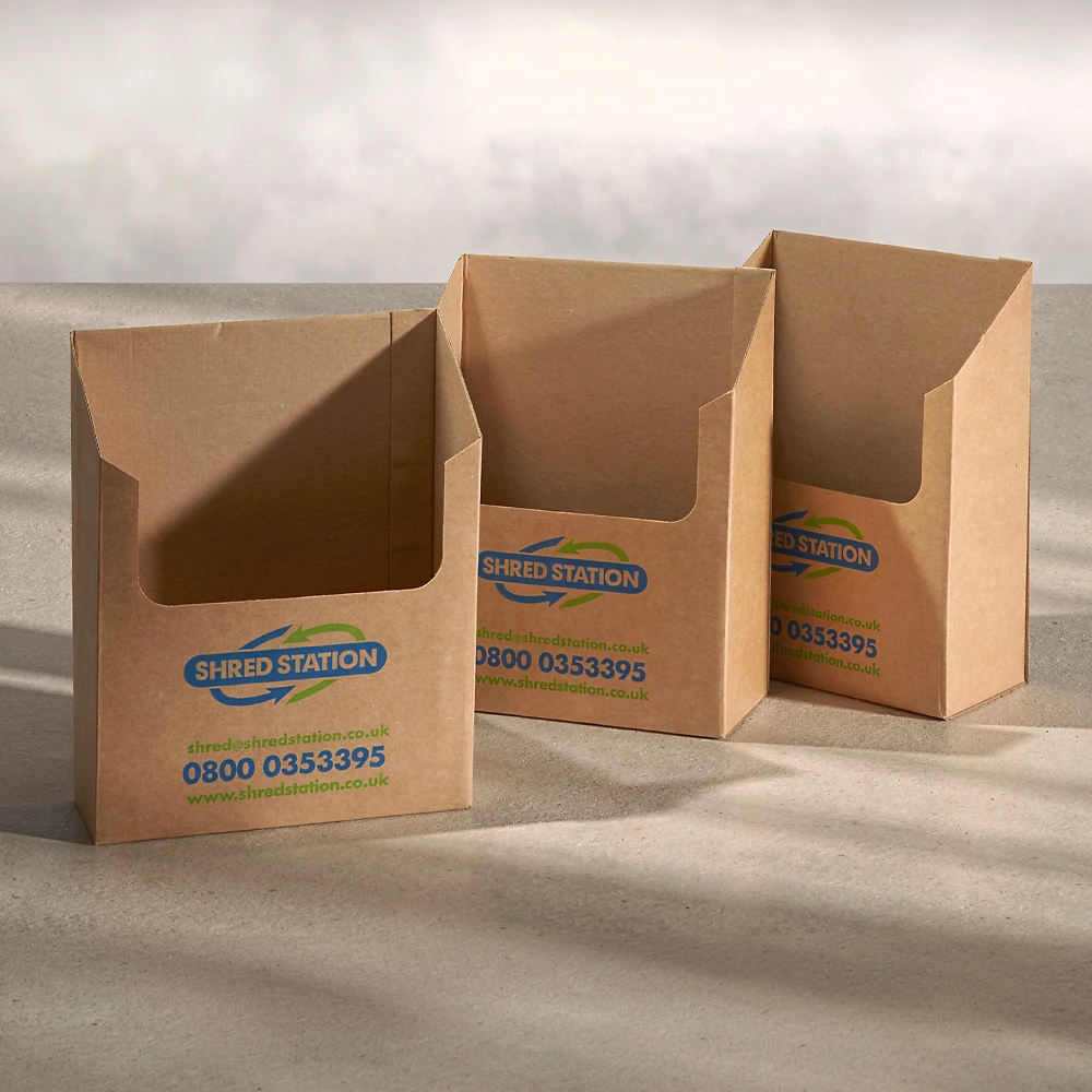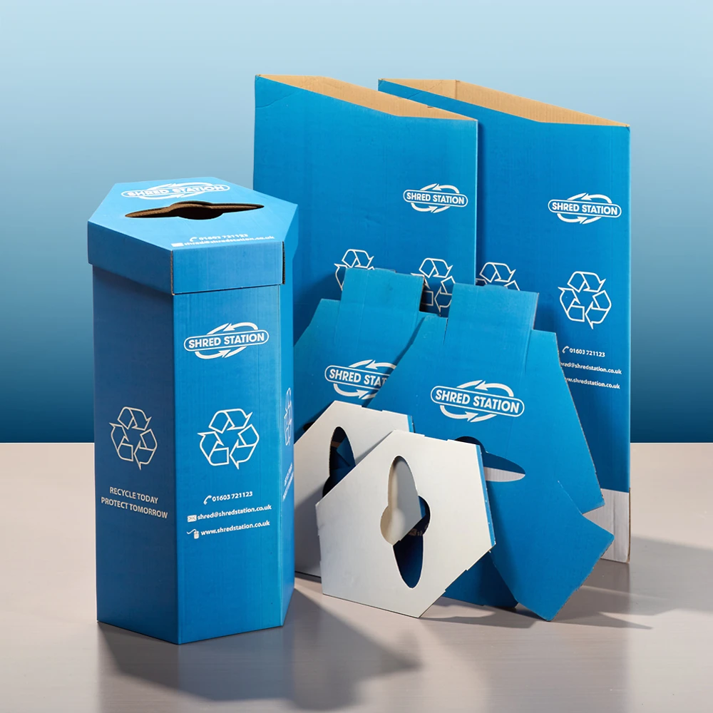
A long-term branding and design project for Shred Station, covering a wide range of applications including vehicle livery, marketing materials, exhibition graphics and printed literature.
The work focused on building a strong, instantly recognisable brand presence across multiple touchpoints, combining bold visual impact with clear communication and consistency across all assets.
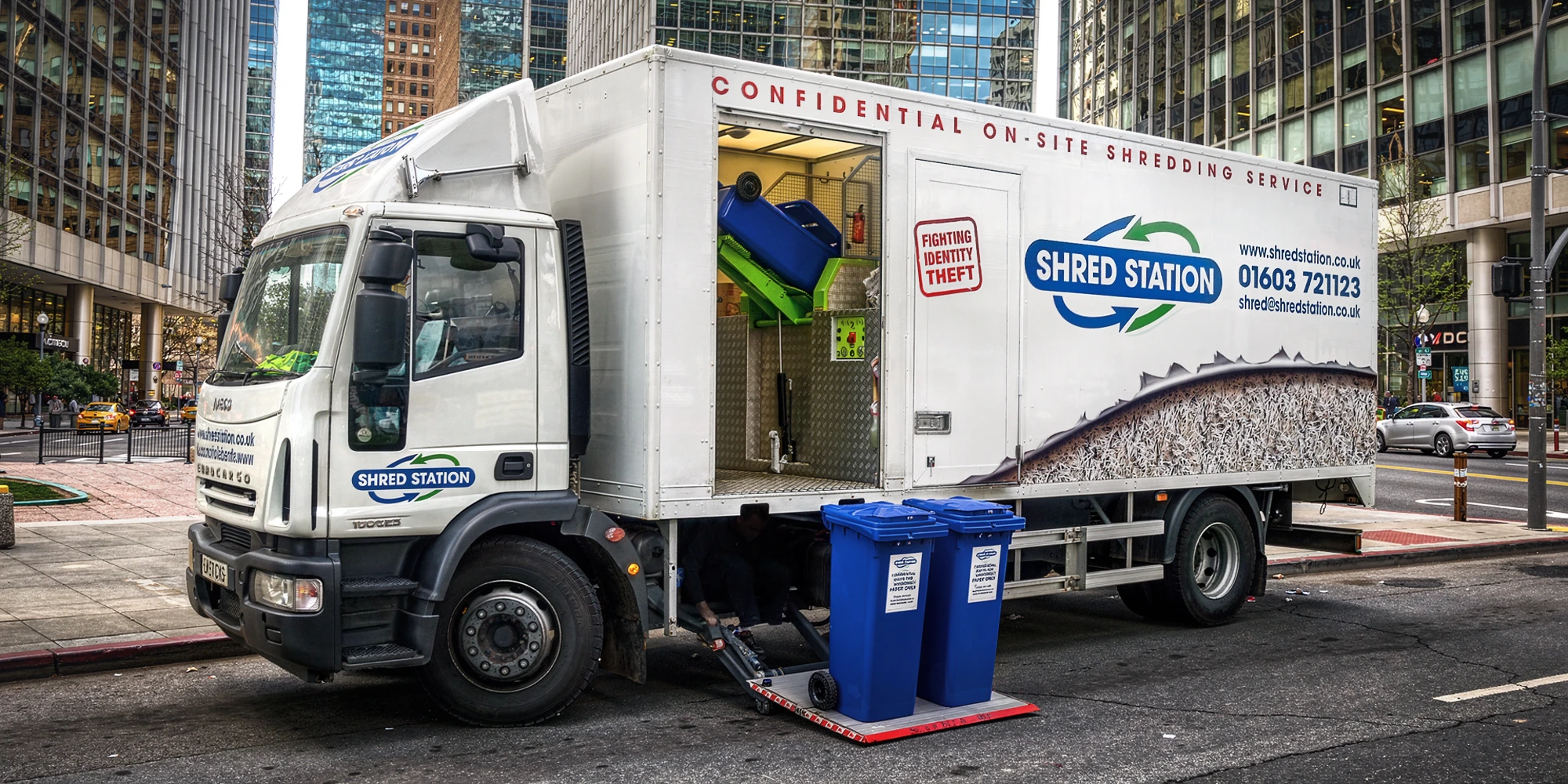
Truck livery design featuring a ripped-open side graphic revealing shredded material within, creating a bold and highly visual representation of the service in action.
Applied across the full vehicle fleet, the design was developed to ensure immediate brand recognition on the road while establishing a distinctive and memorable visual identity for Shred Station.
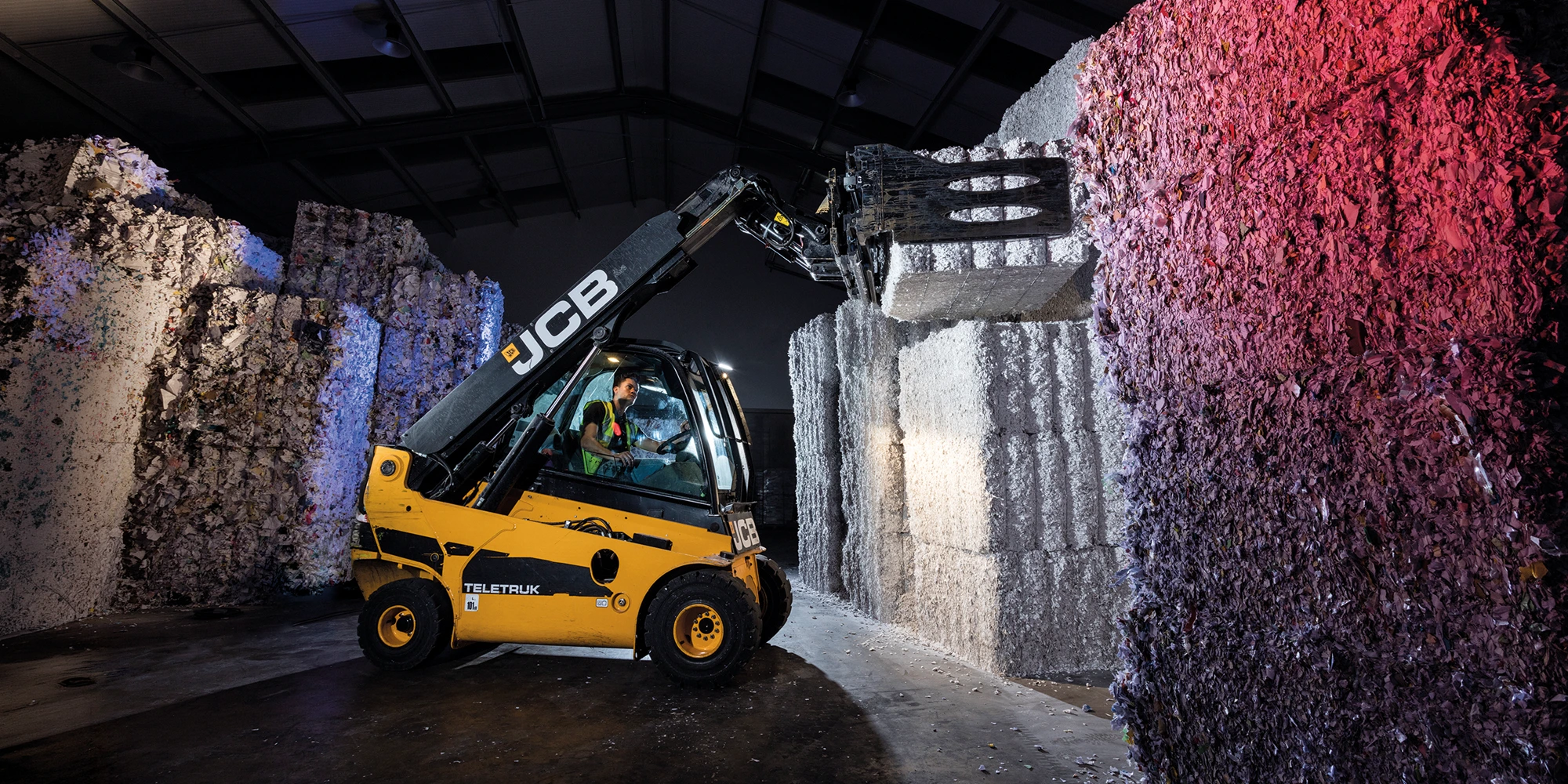
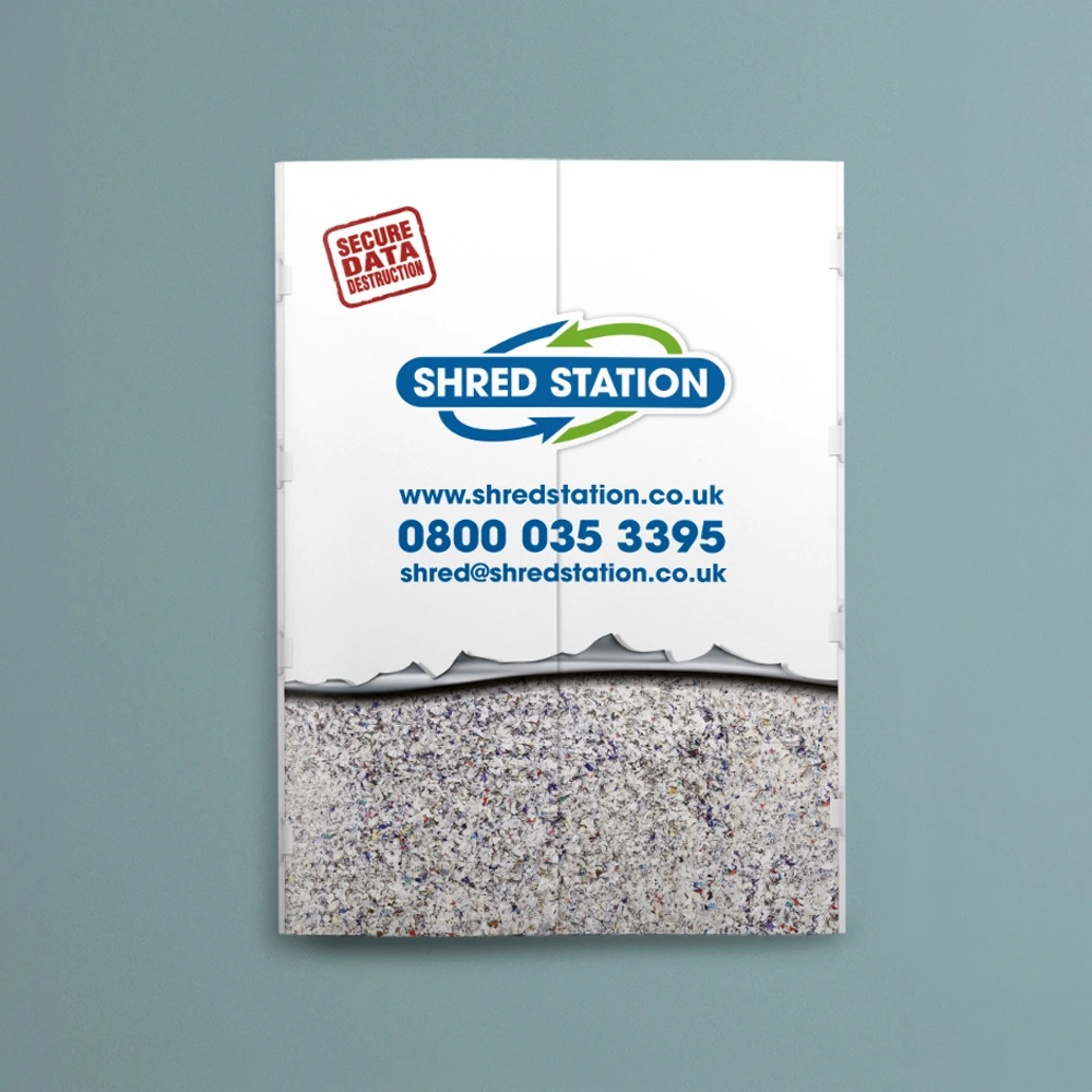
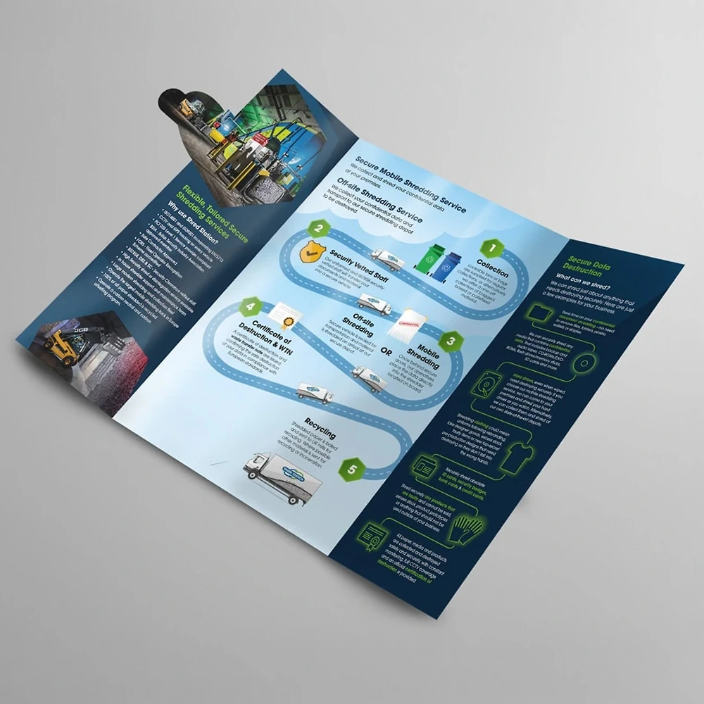
Corporate brochure design incorporating a split-cover concept that mirrors the rear of the shredding trucks. Opening the cover reveals the brochure content, creating a direct link between service and marketing material.
A small selection of the branded packaging and waste paper containers developed as part of the wider identity, designed with a clean, consistent visual approach.
All items were produced using fully recycled materials, supporting the company’s sustainability goals while maintaining a strong and coherent brand presence across all applications.